Tonnellerie Chassin Père & Fils / Logo & Corporate Design | Flyer
About
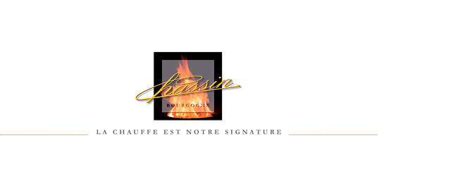
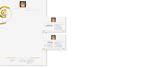
The tonnellerie’s communication media features the same light touch as is seen on their website – minimalist yet professional. The wood shaving, a symbol of the cooper’s craft, is set behind a transparent area, thus creating a layered effect. The logo, comprising the name of the company written over a picture of a fire, symbolises the ancient craftsmanship (the signature) of the artisanal work of toasting the staves (the fire), an area in which Chassin has developed its own unique technique.
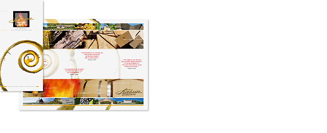
Although in 2D, the leaflet – like the website – although in 2D, shows a photomontage of the pictures taken during the daily work phases. There is also a second photomontage illustrating the Bourgogne region, where the tonnellerie is located and which obviously enhances the value of the company that produces barriques for the wine industry, drawing on its significant expertise in the area’s wood, starting from the selection of the same and continuing throughout the various work phases.